
This document is intended to show the flaws built-in to the design of the Roadmap To Recovery plan that will make it significantly difficult for any district to advance a phase. The first page will be a summary, and then I will unpack each of those points in greater detail in the following pages.
The details of the plan itself can be found on the Governor’s maze of covid response info. You can start here to get those:
https://coronavirus.wa.gov/what-you-need-know/county-status-and-safe-start-application-process
The four criteria that a district must meet in a single report week to advance from Phase 1 to Phase 2 are below:
- Decreasing trend of 10% or more in two-week rate of COVID-19 cases per 100k population;
- Decreasing trend of 10% or more in two-week rate of new COVID-19 hospitalizations;
- Less than 90% Intensive Care Unit (ICU) occupancy; and,
- COVID-19 test positivity of less than 10%.
Summary of problems with the design of the Roadmap To Recovery Plan
- The first two metrics (A and B above) ‘reset’ each week they are counted rather than looking at cumulative improvement over time.
This sets up possible scenarios where total case-rates and hospitalization-rates can drop to low absolute levels, but still do not meet the relative weekly criteria to advance phases. That is, the Governor’s plan punishes slow, steady improvement.
- The resetting of the metrics each week makes it increasingly difficult for all four to line up together in a single week to allow a district to move to a new phase.
If a district has a ‘good’ week and drops the case or hospitalization rate significantly (anywhere from 10-50% in some cases) but does not meet the other three metrics in that same week, those positive gains do not count the next time the metrics are compared. Once the threshold is lower, a smaller number of positive cases can send the district into a sub-10% flattening of the rate of decrease and stop an advancement of phases.
- The metrics being measured to make decisions each week are perpetually 2-6 weeks old and do not reflect the current state.
The case-rate, hospitalization-rate, and positive percentage rate metrics look at statistics 3-6 weeks in the past. The closest real-time metric is the ICU occupancy percentage metric which still measures data that is a full week old. These metrics are a measure of past status but are being used to say that current conditions are still unacceptable for reopening the state.
- The underlying data being used in the reports to evaluate phase advancement are being obscured by the weekly risk assessment reports.
Section 1 -The first two metrics ‘reset’ each week they are counted rather than looking at cumulative improvement over time.
The first two metrics in the Governor’s plan “reset” each week that the statistics are counted rather than being compared to a fixed value. Here is the language of the Governor’s plan:
- Decreasing trend of 10% or more in two-week rate of COVID-19 cases per 100k population;
- Decreasing trend of 10% or more in two-week rate of new COVID-19 hospitalizations;
Both metrics work the same way. Each Friday a 14-day case-rate or hospitalization-rate number is compared to a 14-day rate that was calculated the Friday before. It is important to understand that during each Friday count the 14-day period being used to count with shifts by one week (even though there are two weeks of statistics being counted).
To understand this, let us say that this Friday they count the case-rate numbers for weeks 1 and 2. Next Friday they count the case-rate numbers from weeks 2 and 3. The difference between those two counts is the percentage being used in the metric to determine if that category qualifies for advancing a Phase.
This matters because any gains made no longer are considered as soon as that week’s statistics are no longer being counted—meaning that a slow, steady improvement in case-rate or hospitalization-rate will never trigger the Governor’s thresholds for moving phases.
Let us walk through an intellectual exercise to demonstrate this. For our purpose, assume that our week 1 count of the 14-day case-rate per 100k is 400. (This is not too far off from where Pierce County alone has been off and on lately. I know that the districts include multiple counties, but for our examples it simplifies things to speak in terms of counties as times. The same logic still applies.)
Let us further assume a scenario where the week the 14-day case rate is counted and compared to the previous week’s count that it shows a 9% drop to 364. 9% is close, but not quite enough to allow a move to Phase 2.
Then the following week the count comes in at 331.
331 is again 9% of the previous week that was at 364. But the Governor’s plan still does not consider that good enough to move phases. Never mind that the TOTAL drop from 400 to 331 in that time represents a 17% reduction. This pattern could continue, and it gets more ridiculous the longer it lasts. The chart below continues the 9% weekly drop and how low the numbers get.
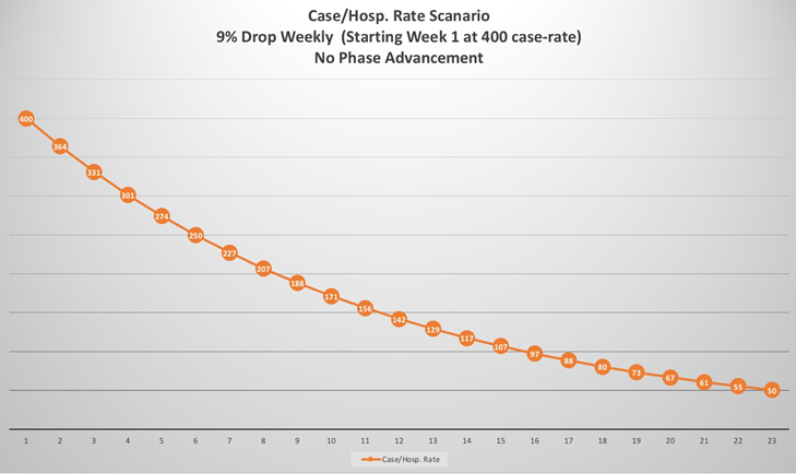
Notice that by week 8 of the case-rate dropping 9%, the calculated case-rate is nearly half what it started at. Still, this is not good enough to advance a phase. By week 15 the case-rate would be nearly a quarter of where it started. Even at numbers this low the Governor’s rules under the “Roadmap To Recovery” won’t allow advancing phases.
Consider a different scenario. What if a district sees a drastic improvement in one of the metrics in a single week. An example would be the 50% reduction in the 14-day hospitalization rate seen in the North Central district in the January 15th report (https://www.doh.wa.gov/Portals/1/Documents/1600/coronavirus/421-006-RoadmapToRecovery-20210115.pdf). They failed to make the requirements in other categories, so that 50% reduction doesn’t matter anymore.
I don’t have the firm numbers for North Central, but for a thought exercise showing the flaw in the plan we can use any stating point. Let us say that the specific number they calculated on January 8th was a hospitalization-rate of 200.
Then assume the January 15th hospitalization rate was 100—which represents the same percentage (50%) listed for North Central in the January 15th report. It is excellent that North Central dropped that much, even though the other categories did not allow them to advance a phase.
But what happens during the next count if the hospitalization rate is calculated to be a total of 95? Well when you compare that to the new “bar” of 100, ninety-five only represents a 5% drop. A 5% drop is no longer considered a “good” metric by the Governor’s plan—even though the total drop over the two weeks of counting is 47.5%!
These thought exercises demonstrate two fatal flaws in the Roadmap To Recovery plan:
First, slow-steady improvement will not allow any Phase advancement.
Second, significant improvement in a single category in any one week is “wiped out” and no longer allowed to factor into a district’s ability to reopen in the future.
Either of these flaws by itself would be nearly enough to make the Roadmap To Recovery an unworkable plan. The combination of both working together has potential to preclude any district from ever moving ahead.
Section 2 – The resetting of the metrics each week makes it increasingly difficult for all four to line up together in a single week to allow a district to move to a new phase.
One of the ways this weekly “reset” of the compared metrics manifests is through the erasure of dramatic improvements in the metric from one week to the next as mentioned in the section above. However, the Governor’s rules for those metrics also mean that the more improvement a district sees over time, the easier it is for a smaller number of cases or hospitalizations to derail the ability to move phases.
To see this look again at our chart from the previous thought exercise:

At the 400 case-rate threshold a 10% improvement is a reduction of 40. But keep in mind that the reduction of 40 is a part of the full formula:
case rate = 14-day case count per 100k population.
Let’s pretend we’re talking about only Pierce a County, with a population around 900k (it isn’t exactly that, but close enough for this exercise).
10% reduction (40 cases) per 100k in Pierce County means 360 less cases over a 14-day period.
9% reduction (36 cases) per 100k in Pierce County means 324 less cases over a 14-day period.
The difference between a 10% reduction (phase worthy) and a 9% reduction (not phase worthy) are those extra 36 cases. If this was the only metric we were looking at, those extra 36 positive cases are what stop us from moving ahead.
But what happens if we are still in Phase 1 in 11 weeks and we’ve had a slow, steady 9% reduction that whole time?
The chart’s week 11 number is 156. Apply the case rate formula (rounding the numbers to the nearest whole where appropriate):
10% reduction (16 cases) per 100k in Pierce County means 144 less cases over a 14-day period.
9% reduction (14 cases) per 100k in Pierce County means 126 less cases over a 14-day period.
The difference between a 10% reduction (phase worthy) and a 9% reduction (not phase worthy) are those extra 18 cases. If this was the only metric we were looking at, those extra 18 positive cases are what stop us from moving ahead.
Certainly, that cuts both ways. If early on 36 extra cases stop phase movement, 36 fewer cases help phase movement. At lower levels 18 positive cases is all it takes to both help or stop phase movement.
The point of the exercise is to demonstrate that in the Roadmap To Recovery the lower our numbers get the more impact a single positive case has on the phase advancement metrics. That is to say, the better the real numbers get the more each individual positive test hurts our chances of moving ahead to a new phase.
The more we improve the case-rate and hospitalization-rate numbers, the harder it will be to get out of Phase 1.
Section 3 -The metrics being measured to make decisions each week are perpetually 2-6 weeks old and do not reflect the current state.
The Roadmap To Recovery report includes paragraphs of disclaimers about the nature of the data itself. A fair summary would be that the report notes the difficult nature of collecting and collating Covid statistics across the state in a timely fashion.
The result is one that may unintentionally mislead the public (to be fair, the report is up-front about the difficulties) and certainly ends up being logically unsound. Here is a sample from the January 15th report to illustrate the problem.

The January 15th report looks at the case-rate of 12/6 – 12/19 and compares it to 12/20 – 1/2
Keep in mind that the January 15th report was to determine if each district was eligible to advance to Phase 2 starting on January 18th. In an effort to say that the Covid situation is too dire to open right now, the Roadmap To Recovery plan factors in data as far back as 40 days ago. Worse, the most recent data it considers for case-rate is a full two-weeks old!
Likewise, the most recent data it considers for the two hospital-related metrics are a full week old.
The positive-percentage metric is also a full week old, and is subject to question anyway since the WA DOH’s own web page cautions against putting too much weight on that statistic given the state’s data collection delays. (https://www.doh.wa.gov/Emergencies/COVID19/DataDashboard)
This warning about the delay in properly treating negative tests—by extension, a delay that makes the positive percentage rate artificially high—has been posted in some fashion on the WA DOH covid dashboard daily since Thanksgiving.
All of this is to point out that nobody should falsely believe that each Friday’s Roadmap To Recovery report is a reflection of the current situation in Washington.
It is not that.
It is instead a reflection of various statistics in the past 2-6 weeks—each metric looking at statistics from different specific timeframes, and then hobbling them all together to make decisions about what should be allowed in the future.
Any positive trend in the state’s covid statistics today will not appear in these reports for 2-4+ weeks, but those extra weeks could make the difference between a business being able to ever open again or not.
Section 4 – The underlying data being used in the reports to evaluate phase advancement are being obscured by the weekly risk assessment reports.
This is a simple point. The risk assessment reports being used to determine phases do not include the actual numbers they are using to determine the percentage of the metric. This may be good for report simplification, but it does a neat job of hiding the flaws outlined in the Roadmap To Recovery.
When districts end up with much lower levels of case-rates and hospitalization-rates of the kind shown in the charts above, the risk assessment will not indicate it. Using percentages without hard numbers allows the Governor to hide the flaws in this plan. People would be rightfully enraged if they could see in the report that they were still being held in Phase 1 even though their districts case-and-hospitalization rates are only a fraction of where they were when the plan was announced.
Reporting only percentages hides that. One could not be faulted for believing that the decision to only report percentages is evidence that the Governor’s office knows exactly the ramifications of the flawed rules they put in place for this plan.
Conclusion
The four metrics (two of them especially so) built-in to the Roadmap To Recovery have individual flaws that will make it unlikely that all four metrics will meet the reopening criteria in the same report week.
Worse than that, positive gains made in one report week are no longer factored into future reopening metrics. Districts are not only punished for demonstrating slow, steady improvement, but if all four metrics are not met in a single month then that district would be better off not having large improvements to begin with.
It is difficult to see how any district will advance to another phase under the rules currently in place. Some may eventually get lucky and have all the right factors fall their way in a single week, but some may never be that lucky.
The Governor has had nearly 10 months to figure this out. We may never know whether the fatal flaws in this newest plan are there intentionally or through neglect, but however they got there this plan is worse than any of the others. The reliance on percentages in the weekly reports hides the flaws in the plan from the public.
Certainly, a plan like this one that relies more on a lucky alignment of stale, disparate statistics to determine reopening rather than a current, accurate picture of the real status of covid in our state should not be allowed to remain in place.
3 Thoughts on “How the 2021 Washington Roadmap To Recovery Plan Is Built To Fail”